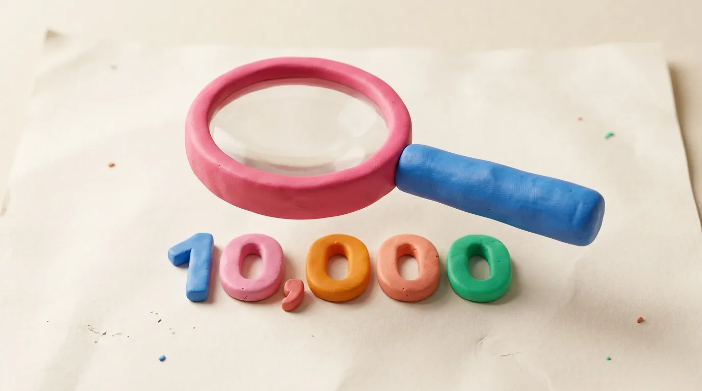
What We Learned Analyzing 10,000 Ads in Our Repository
We analyzed 10,000+ real ads from Meta and LinkedIn. Here are the CTA patterns, visual layouts, copy lengths, and industry insights we discovered.
When you build an ad repository, you end up with a lot of data. Like, a LOT of data. We have been collecting, categorizing, and analyzing thousands of real ads from real brands, and the patterns we found are genuinely fascinating.
Some of these insights confirmed what we already suspected. Others completely surprised us. All of them can help you create better ads. So let me share the highlights.
Grab a coffee. This one is going to be fun.
How We Crunched the Numbers
Before we dive in, a quick note on methodology (because we are nerds and nerds explain their methods):
- Sample size. Over 10,000 ads collected from Meta Ad Library and LinkedIn across multiple industries
- Time period. Ads running between January and March 2026
- Categories. Ecommerce, SaaS, agencies, local services, finance, education, health and wellness
- Analysis. AI-assisted categorization of CTA types, visual layouts, copy length, hook patterns, and format choices
This is not a random sample of every ad ever. It is a curated collection of ads from brands that are actively spending money. If they are paying to run it, they probably have some reason to believe it works. Probably.
CTA Patterns: "Learn More" Is King
Here is our breakdown of the most common CTAs across all ads:
- "Learn more" (34%) — the safe, versatile, low-commitment option
- "Shop now" (22%) — direct and transactional, dominates ecommerce
- "Sign up" (15%) — SaaS and newsletter favorites
- "Get started" (11%) — the cooler sibling of "sign up"
- "Book now" / "Contact us" (8%) — services and B2B
- Everything else (10%) — custom CTAs, "Download," "Watch now," etc.
The surprise? "Learn more" beats "Shop now" even in ecommerce. Turns out, people like feeling informed before they buy. Who knew? (Everyone. Everyone knew. But brands keep ignoring it.)
Visual Layouts: Single Image Still Dominates
With all the hype around video and carousels, you might think static images are dead. They are very much not:
- Single image. 52% of all ads. Still the workhorse. Quick to produce, easy to test, performs reliably.
- Carousel. 23% of all ads. Growing fast, especially on LinkedIn where it dominates B2B.
- Video. 19% of all ads. Higher engagement when done well, but way harder to produce at scale.
- Other. 6% — collections, instant experiences, playable ads, etc.
Key insight: the best-performing brands do not pick one format and stick with it. They test multiple formats with the same message. The format is the delivery vehicle, not the message itself.
Copy Length: The Platform Divide
This one is fascinating. Copy length varies dramatically by platform:
- Meta primary text. Sweet spot is 40-80 words. Shorter than that feels thin. Longer than that gets truncated behind "See more."
- LinkedIn sponsored content. 100-150 words performs best. LinkedIn audiences actually read, so give them something worth reading.
- Headlines across both. 5-8 words. Crisp, clear, no fluff. The headline is not the place for your poetry skills.
Hot take: most ads have too much copy, not too little. If your ad copy needs a "See more" button to convey the basic message, you need to edit, not expand.
Industry Patterns: Not All Ads Are Created Equal
Different industries have wildly different ad patterns:
- Ecommerce. Product-forward visuals, price anchoring, urgency CTAs ("Limited time," "Only X left"). Carousels for multi-product showcases.
- SaaS. Problem-solution framing, screenshots or product demos, social proof heavy ("Trusted by 10,000+ companies"). LinkedIn-dominant.
- Agencies. Portfolio showcases, before/after results, case study snippets. The most visually polished category (naturally).
- Finance. Trust and credibility above all. Lots of numbers, certifications, and serious-looking photography. The least fun but most regulated category.
- Health and wellness. Transformation stories, UGC-style content, aspirational imagery. Heavily platform-dependent (Meta-heavy).
The takeaway? Know your industry's norms before you try to break them. Breaking conventions works when you understand them first.
What This Means for Your Next Ad
Here are the actionable takeaways:
- Start with proven structures. Do not reinvent from scratch. Use the repository to see what is working in your industry.
- Test multiple formats. Do not commit to one format. A/B test single image vs carousel vs video with the same message.
- Match copy length to platform. Short and punchy for Meta, meatier for LinkedIn.
- Use "Learn more" more often. Seriously. It outperforms more aggressive CTAs in most contexts.
- Know your industry patterns. Then decide whether to follow them or strategically break them.
See the Data for Yourself
All 10,000+ of these ads are browsable in our ad repository. Filter by your industry, see what your competitors are doing, and find the patterns that work for your niche.
Data is great. But data you can act on? That is even better. Start browsing.