7 Reasons Your Meta Ads Look "AI-Generated" (And How to Fix Each One)
Your Meta ads look AI-generated because of 7 fixable tells: stock faces, warped hands, off-brand color, no real product, empty copy, template sameness, and no human voice.
I audit a lot of Meta ad accounts, and lately I can spot the AI-generated creative before I even read the copy. Not because AI tools are bad, they have saved my clients real money, but because most people let the tool make the decisions a marketer should be making. The result is a particular flavor of ad that scrolls right past everyone: technically fine, instantly forgettable, and obviously machine-made.
The good news is that the "AI look" is not one big problem. It is a handful of small, fixable tells. Below are the seven I see most often, ranked roughly by how badly they hurt performance, each with the fix I actually use. None of this requires a design team. It mostly requires you to stop accepting the first thing the generator hands you.
1. Generic stock-model faces
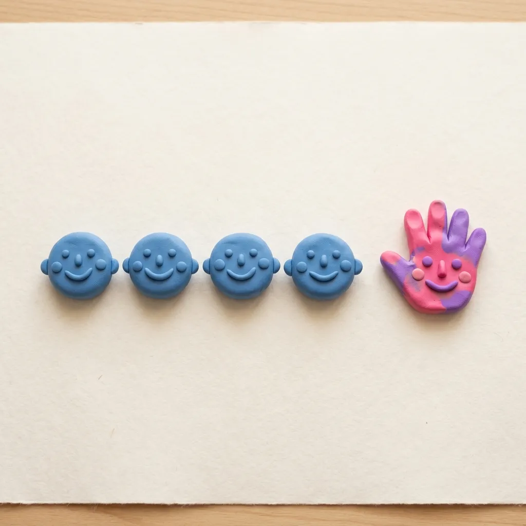
The single most common tell is the impossibly symmetrical, mid-laugh stock face. AI loves to generate a thirty-something with flawless skin, perfect teeth, and zero personality, because that is the statistical average of every face it trained on. Your audience has seen that exact person in a thousand other ads. Their brain files it as "ad" and keeps scrolling.
The fix. Use a real person whenever you can: a founder, a customer, a team member, even a quick phone selfie. Authentic imperfection out-converts synthetic perfection almost every time. If you must use a generated or stock person, pick one with a specific, slightly off-center expression, and put them in a real context rather than against a void.
2. Uncanny hands and warped details
Hands are the classic giveaway, but it is bigger than that now. Look at the edges: a sixth finger, a watch that melts into a wrist, jewelry that fuses to skin, text on a product label that dissolves into gibberish, a coffee cup with two handles. These artifacts read as "wrong" even to people who could not tell you why, and once a viewer senses something is off, they stop trusting the whole ad.
The fix. Zoom in to one hundred percent and inspect every hand, every edge, and every piece of small text before you launch. Crop tightly to hide problem areas, regenerate the asset, or composite a clean real photo of the product. One warped detail is enough to sink an otherwise strong creative, so this thirty-second check pays for itself.
3. Off-brand color and styling
AI generators default to whatever looks pleasing in the abstract: muted gradients, trendy pastels, a vague tech-blue. None of it is your brand. When your ad uses colors, fonts, and a visual tone that appear nowhere else in your funnel, it feels borrowed, because it is. Worse, the click-through lands on a page that looks like a completely different company, and you lose the few people who were curious.
The fix. Lock your palette, type, and tone before you generate anything, and hold every output to it. This is the work of a documented brand DNA that every asset has to pass through. The ad, the landing page, and the product should feel like one continuous experience. As I argue in why consistency, not creativity, is the real ad problem, consistency is not a nice-to-have here, it is a trust signal, and AI tools will not enforce it for you unless you make them.
4. No sign of the actual product
A huge share of AI ads are pure decoration: a swirl, an abstract 3D blob, a generic lifestyle scene with no connection to what is being sold. They look like art, not advertising. The viewer never sees the product, never understands the offer, and never has a reason to click. Pretty is not the same as persuasive.
The fix. Show the real thing. The dashboard, the package, the app screen, the before-and-after. If you sell something physical, photograph it in a real environment. If you sell software, show the actual interface. Specific, concrete product imagery beats beautiful abstraction in almost every test I have run.
5. Weak, empty copy
The visual tells get the attention, but the copy is often the bigger problem. AI-written ad copy gravitates to the same hollow phrases: "Unlock your potential." "Elevate your business." "Discover the future of." It is grammatically perfect and says absolutely nothing. There is no number, no claim, no reason to believe, and no specific person it is talking to.
The fix. Replace abstraction with specifics. Swap "boost your results" for "cut your reporting time from four hours to twenty minutes." Name the audience, name the outcome, name the proof. Use AI to draft fast, then edit ruthlessly for concreteness, and feed it a real brief so it has something concrete to work from in the first place, which I break down in how to brief AI for ad copy. A good rule: if the sentence could appear in a competitor's ad unchanged, rewrite it.
6. Template sameness across the set
When you batch-generate ten variations from one prompt, you do not get ten ads. You get one ad ten times: same layout, same composition, same rhythm, with the words shuffled. Run them together and Meta's algorithm sees near-duplicates, your audience sees the same thing on repeat, and creative fatigue sets in fast. The whole point of testing variations is meaningful difference, and template sameness kills it.
The fix. Vary the structure, not just the text. Different hooks, different formats, different angles: a testimonial, a product demo, a bold statistic, a problem-agitate open. Start each variation from a different proven layout rather than recoloring one, an idea I expand on in why your best ad already exists. Real variety is what keeps a set alive past the first week.
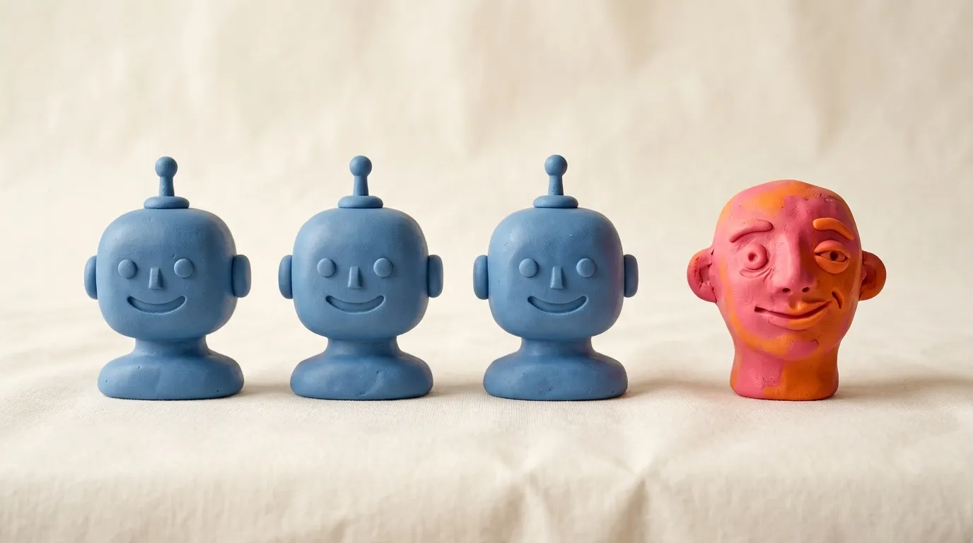
7. No human specificity
This is the one that ties the rest together. The best ads feel like they came from a specific person, with a point of view, talking to a specific reader. AI defaults to the safe, averaged-out middle, so its output feels like it was written for everyone, which means it lands with no one. There is no voice, no opinion, no small detail that says a human who actually understands the product made this.
The fix. Inject specificity on purpose. A real customer quote, an oddly exact number, a slightly contrarian opinion, an in-joke your audience will recognize. These are the things AI smooths away by default and the things that make a person stop. Treat the generator as a drafting partner, then add the human fingerprint it cannot.
The pattern behind all seven
Notice that none of these tells is really about the AI being weak. They are about starting from nothing and accepting the average. Generated-from-a-blank-prompt creative defaults to the generic stock face, the safe palette, the empty headline, the one repeated layout, because the average of everything is, by definition, generic.
The fix that covers all seven at once is to change where you start. Begin from a real, proven ad, one that already ran and already worked, and then make it specifically yours: your product, your palette, your voice, your point of view. That is the approach behind tools like Adkumo, where you adopt a proven ad from a curated repository and rebuild it through your brand DNA, so the color, tone, and specificity are enforced rather than hoped for. If you want to poke at how that works, it is worth a look. Whatever tool you use, the principle holds: proven structure plus genuine specificity is what stops an ad from looking machine-made.
The bottom line
AI did not make your ads look generic. Letting the AI make the creative decisions did. Run through this list before you launch: real faces over stock perfection, clean details, on-brand color, the actual product, concrete copy, genuine variety, and a human fingerprint on top. Fix even three of these and your account will stop looking AI-generated, and start looking like it belongs to a brand someone built on purpose.