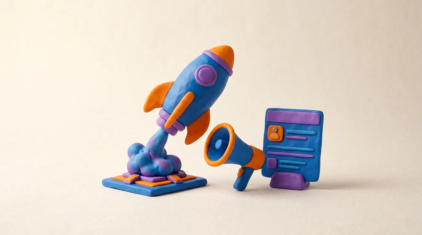
We Studied 50 LinkedIn Ads That Got Clicks. Here's the Pattern.
I analyzed 50 high-performing LinkedIn ads and found 7 repeatable patterns: sharp hooks, specificity, native feel, real proof, and one clear CTA.
Over the years I have saved a swipe file of LinkedIn ads that clients, contacts, and a few friendly competitors confirmed were actually performing, not just running. Real click-through, real pipeline, real spend behind them. I am a growth consultant, not the brand behind any of these, so I look at them with no loyalty to a format and one question: what do the winners have in common that the losers do not? If you want to start collecting your own, this guide on how to build a swipe file covers the habit that made the difference for me.
The answer is less mysterious than the agency decks suggest. The ads that earn clicks on LinkedIn are not the prettiest or the most clever. They are the ones that respect how the feed actually works. People on LinkedIn are scrolling between a colleague's promotion and a half-read industry post. An ad has roughly a second to feel relevant before the thumb keeps moving.
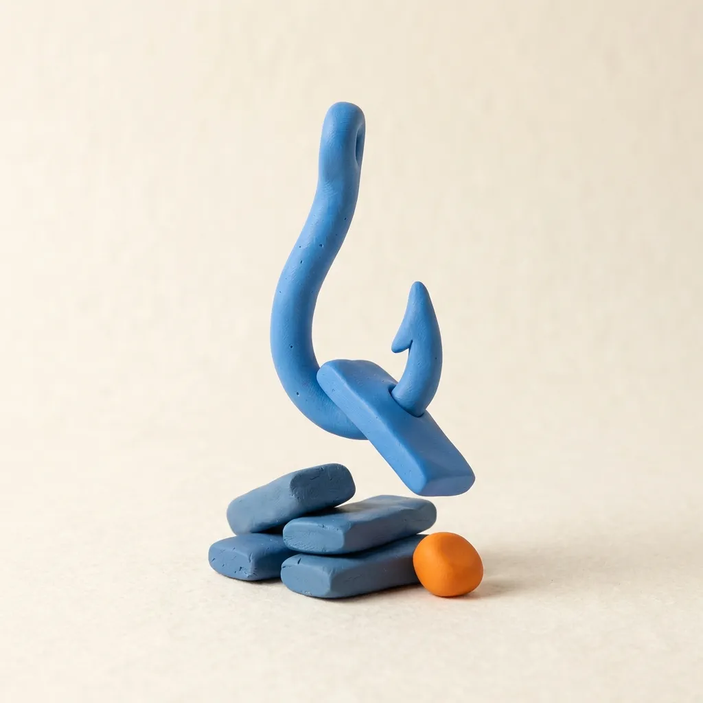
Below are the seven patterns I keep seeing again and again across the ads I have studied. I describe each one in words and, where it helps, in a sculpted little illustration. None of these are real brand screenshots, they are the underlying shape of what worked. If you mostly run paid social on Meta, it is worth comparing notes with this look at Meta ads versus LinkedIn ads before you copy a playbook across platforms.
Pattern 1: the first line does all the work
In my experience, the high-performing ads almost always front-loaded a single, specific idea into the first line of the intro copy. Not a tagline, not a brand promise, a sentence that named a problem the reader instantly recognized. "Your SDRs spend 11 hours a week updating the CRM." "Most Series B finance teams close the books in 9 days. The best close in 3." If hooks are the part you struggle with most, I pulled apart the broader craft in what a thousand ad hooks taught me.
LinkedIn truncates intro text after a couple of lines, so anything past that first sentence is hidden behind a "see more." The winners knew it. They spent their one visible line on the sharpest, most concrete claim they had, and let everything else live below the fold.
Pattern 2: specificity beats adjectives
The losing ads were full of words like "powerful," "seamless," and "next-generation." The winning ads were full of numbers. A precise figure does two things at once. It signals that a real person with real data wrote the ad, and it gives the reader something concrete to react to.
- Named the metric. "Cut onboarding from 6 weeks to 8 days," not "onboard faster."
- Named the audience. "For RevOps leads at 200-plus-person SaaS companies," not "for growing businesses."
- Named the cost of inaction. "The average mid-market team loses 40 hours a month to this," not "save time."
Specificity is also a filter. A vague ad invites everyone and converts no one. A specific ad repels the wrong audience and earns the right one, which is exactly what you want when you are paying LinkedIn's premium cost per click.
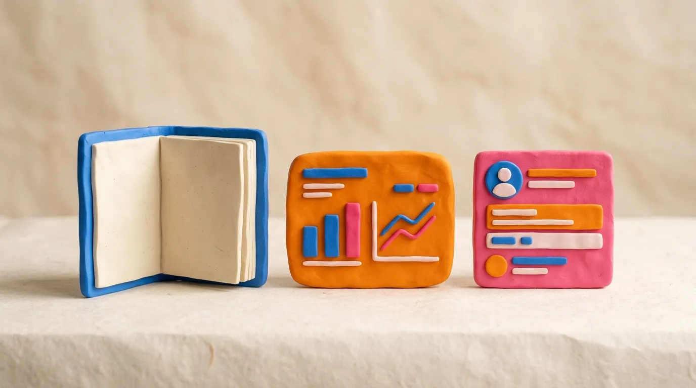
Pattern 3: it does not look like an ad
The single biggest visual tell separating winners from losers was production polish. The ads that performed looked like something a colleague might have posted. Flat color blocks, a readable sans-serif, one chart or one screenshot, a real human face that was clearly not a stock model. The ads that flopped looked like billboards, glossy gradients, three competing logos, and a model laughing at a salad.
LinkedIn is a feed of native content, and the brain has learned to skip anything that screams "paid." The winners leaned into the medium rather than fighting it. Several of the best performers were quite literally a screenshot of a product, a graph, or a customer message, with minimal dressing.
Pattern 4: borrowed credibility, shown not claimed
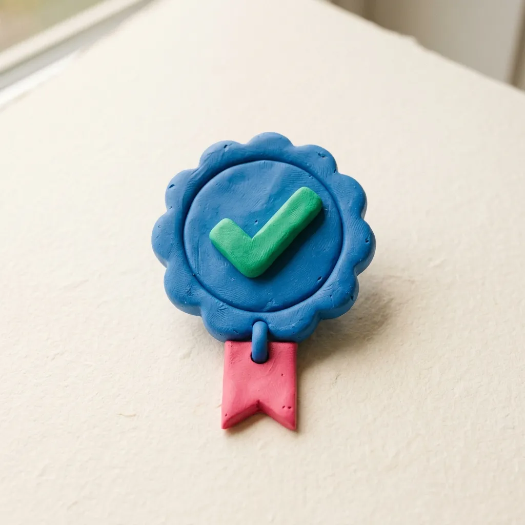
Social proof appeared in roughly four out of five top performers, but the way it appeared mattered. "Trusted by leading companies" did nothing. A named logo strip, a specific customer result, or a direct quote with a real title attached did a lot.
The pattern was always concrete. "Notion cut their reporting time by half" beats "trusted by thousands." A two-line quote from a named VP of Sales beats a five-star graphic. On a platform built around professional reputation, proof is the currency, and the winners spent it in specifics.
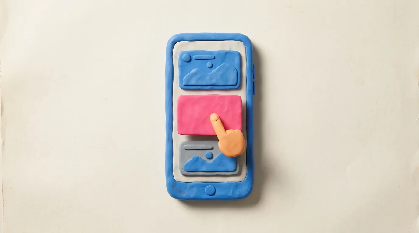
Pattern 5: one ask, stated plainly
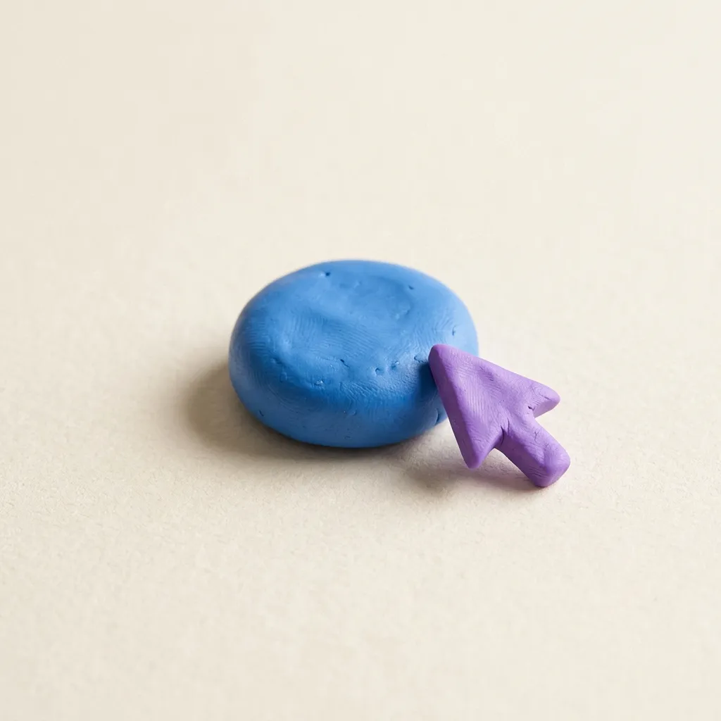
The losing ads hedged. "Learn more, book a demo, download the guide, follow us." The winning ads picked one action and made it obvious. And critically, they matched the size of the ask to the temperature of the audience.
Cold audiences got a low-friction offer: a guide, a benchmark report, a short calculator. Warm audiences who had already engaged got the demo or the trial. Nobody asked a stranger to book a 30-minute call in the first impression, because nobody says yes to that from a feed. The button text was plain and verb-led, "Get the benchmark" or "See it in action," not "Submit" or a vague "Discover."
Pattern 6: the offer is legible in one read
A surprising number of mediocre ads never made it clear what you would actually get. The strong performers answered three questions before the reader had to ask them. What is it. Who is it for. What happens when I click.
That clarity is unglamorous and it is the whole game. When the offer is legible in a single read, the click is a small, safe decision. When the reader has to reverse-engineer what you are selling, the click never happens, no matter how striking the creative is.
Pattern 7: one idea per ad, tested many ways
The last pattern was not inside any single ad, it was visible across the accounts that consistently won. They did not run one perfect ad. They ran one clear idea expressed a dozen ways: the same proof point as a quote, then a stat, then a screenshot, then a question. Same message, different angle, so the feed never went stale and they could see which framing actually pulled.
This is the part most teams get wrong. They labor over a single hero creative, launch it, and let it fatigue. The winners treated creative as a portfolio. The hook stayed; the wrapping rotated. That is also where volume becomes a real constraint, because producing ten on-brand variations of one idea by hand is slow and expensive.
Putting the pattern to work
If you compress all seven patterns into one sentence, it is this: a winning LinkedIn ad makes a specific, credible claim to a specific audience, looks native to the feed, and asks for one sensible next step. None of that requires a creative genius. It requires discipline and repetition.
The harder problem, once you know the pattern, is not knowing what good looks like. It is producing enough on-brand variations of a proven structure to actually test your way to a winner, and getting them live without a week of back-and-forth. That production-at-volume step is where I see teams stall. If that is your bottleneck, Adkumo is worth a look: you can start from a proven ad, spin up on-brand variations of it, and push them straight to LinkedIn, so the pattern in this post becomes something you run on Monday rather than admire on a slide.
But start with the patterns. Pull your last ten LinkedIn ads, read only the first line of each, and ask whether a busy stranger would recognize their own problem in it. That single test will tell you more than any benchmark I can give you.